Two strategies to drive screenshot testing in Mobile projects
Context#
When talking about Mobile projects or products, especially mature and large ones, screenshot tests are a curious beast among the validations we want to shift left in the Software Development Lifecycle.
The iOS community has taken advantage of screenshot tests at scale for a few years, thanks to iOS simulators painlessly available at Continuous Integration systems and the fast feedback such tests provide in the local workstation.
On the other hand, having Android emulators working in CI systems might be challenging even today. This fact certainly contributed to the need for more solutions in this domain and, consequently, to the poor adoption of screenshot tests for large Android projects over the years. Only recently a few community-driven alternatives emerged and started getting traction.
In an upcoming article, I’ll share more focused insights about modern solutions we have for screenshot testing in the Android ecosystem. Today I am writing about two strategies a team can adopt and follow regarding this testing practice, pinpointing a few differences between them.
Both approaches are ecosystem-agnostic and have a common decision point: the presence or the lack of a Design System implementation that Engineers can use to ship features faster.
Understanding screenshot tests in Mobile projects#
Products that talk to users through a Mobile application face three horrible limitations compared to something distributed exclusively over the Web:
- There is gatekeeping promoted by App Stores and their related app review processes
- When a new release for a Mobile product is out, this does not mean the user will install it
- There is no way to rollback to a previous version once the user installs an app or its update.
All three points contribute to a twisted incarnation of Continuous Delivery in the context of Mobile Software products. These points also directly impact several Engineering practices on those projects.
For example, adopting Feature Flags for Mobile products at scale becomes a non-negotiable option. Also, there is way more work to do regarding verifications we want to run during Continuous Integration to catch bugs before they reach out to the users.
Screenshot tests offer a safety net to detect and prevent a particular class of UI bugs. They can’t prevent bugs attached to specific user interactions against the UI, but they can ensure we don’t ship a broken layout.
In this context, screenshot testing fits under the non-functional tests we want in a test suite. Most likely, they won’t prevent broken functionality in the final product, but they provide guarantees that help us to deliver the desired user experience.
The screenshot testing tooling generally runs on top of a testing environment that can effectively render User Interfaces (e.g., Android/Instrumentation). This way, the test takes a View as a test subject and accepts a set of View Attributes as inputs.
The tooling eventually abstracts away an image-matching engine it uses to compare the rendered View against the expected outcome, assigning a result to the test.
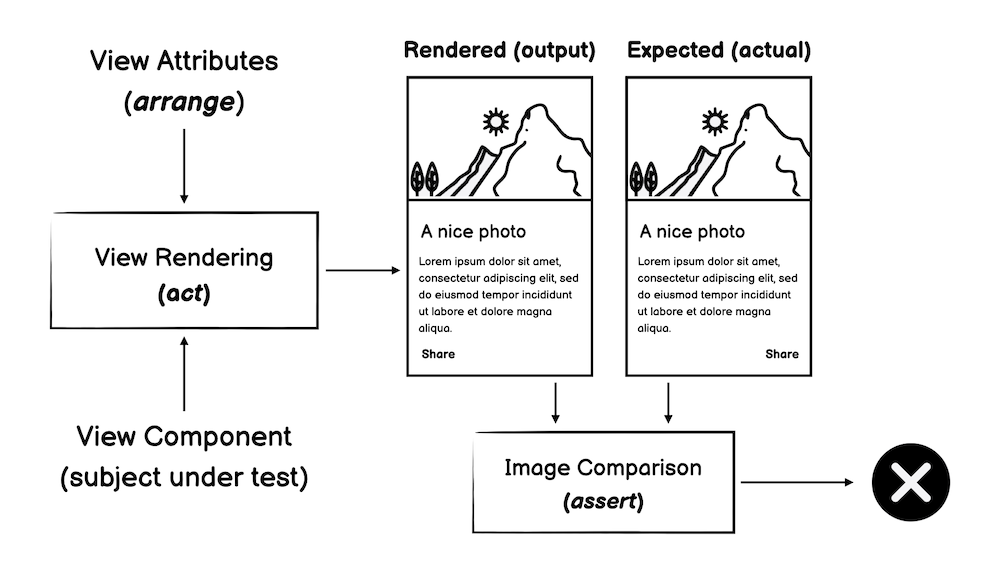
An overview of screenshot tests is required since I see such tests as narrowed integration tests that target the UI infrastructure. Therefore, a well-designed screenshot test should always exercise a set of UI elements in isolation. Employing screenshot tests as component tests is an anti-pattern in my opinion, thus something to be aware of and avoid. I’ll go back to this idea later in this article.
Screenshot testing in the absence of a Design System#
When a team lacks a Design System with programmable components, the reasonable way to adopt screenshot testing is to take an entire screen as the subject under test, thus, structuring test cases to match the application’s user perception at a given time.
The View attributes to arrange split from valid screen states for each considered screen. Typically, we want to test states like Loading-Content-Error, but eventually, other conditions might be suitable for testing, especially in complex interfaces.
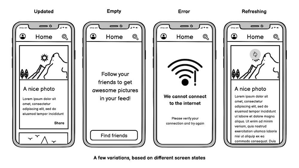
Additionally, each state might have variations from which we want UI guarantees. For example, the following image shows how we can explore the scenario of updated results from the UI stressing perspective:
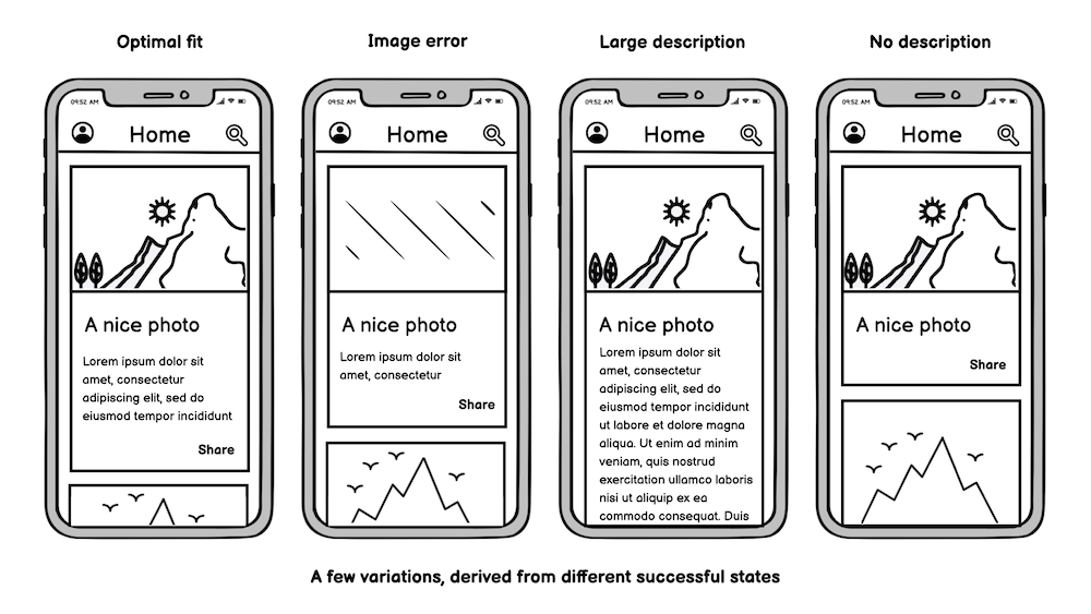
When following this strategy, it’s easy to realize that the screenshot tests code base scales according to the number of screens suitable to test. On the limit, to have full coverage, we’d need to consider all screens we deliver in the product, all the possible states for each screen, and all possible variations within each state.
Based on such a scenario, consider an application composed of the following:
- 100 screens with
- Three testable states per screen (on average) and
- Three variations of each testable state (on average)
Based on these numbers, we expect around 900 tests to define a solid safety net against visual regressions for such a product.
Screenshot testing when a Design System is available#
For the sake of argument, let’s consider the scenario where there is only one centralized Design System that Engineers use to speed up the development of features.
Regardless of the adoption of the Design System across implemented features and irrespective of the extension of screen components covered by it, for each defined element, we can define variants based on different attributes that stress that element visually:
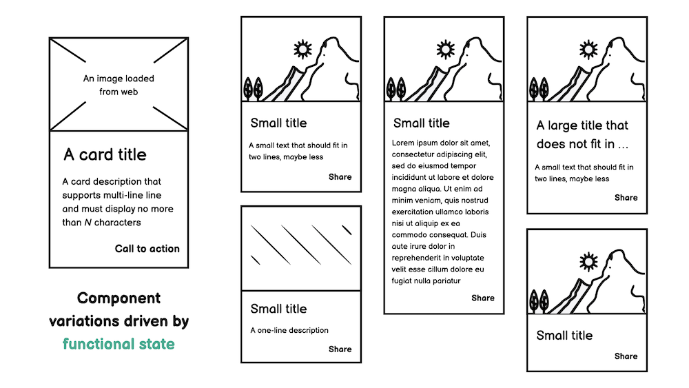
When following this strategy, it’s easy to realize that the screenshot tests code base scales according to the number of components in the Design System. On the limit, the Design System drives 100% of product UI, meaning that every product screen defines all its UI elements on top of the curated components.
Based on such a scenario, consider a Design System that defines:
- 50 programmable components with
- 10 testable variations per component (on average)
You should note that, in this example, the number of variations under test for a component is considerably higher than the number of variations per screen state from the previous example.
In such a situation, circa 500 tests should suffice to define a test suite that fights ordinary UI regressions. Eventually, we’d also like to add some tests covering typical combinations of components in the test suite, exercising them in an aggregated fashion.
Let’s consider that we add another 100 tests for such combinations. We still have around 600 cases in our test suite, approximately 33% fewer tests than we evaluated in the previous strategy, where no Design System was available.
Insights from the trenches of real projects#
If you think I gamed the numbers in the previous examples, you’d be surprised to learn that they are close to real-world projects delivering products that serve hundreds of thousands of users daily.
After chatting with a few friends in the industry and collecting a few data points, and also considering projects I worked on the previous years, it’s not an exaggeration to share the following facts:
- A fully featured Design System might define 40 to 100 programmable components.
- A complex Mobile product might enclose 150 to 300 screens.
- Testable states might explode with variations driven by the OS state (e.g., Light/Dark mode)
- It’s almost impossible to have 100% of the product UI driven by a centralized Design System.
Given the complex nature that Mobile projects assume at scale, it’s clear that there is no way to stick with a single screenshot testing strategy for the whole product in the long run. It’s pretty common to have feature teams implementing non-standard components due to business requirements (e.g., a custom chart, custom form fields, etc.)
As I’ve shown, we don’t need screenshot tests for the scenario where we have screens entirely driven by the Design System, most likely those “low-level screenshot tests” already prevent the same visual bugs we want to catch.
On the other hand, for a feature requiring a UI implementation in which a Design Screen doesn’t provision elements, some screenshot tests over the entire screen state might be valuable.
However, the main takeaway from evaluating the two strategies is still valid, even in a mixed approach. When a Design System is present, the focus should be on screenshot tests that catch visual regressions at that level, pushing the project and the product to take advantage of existing components over time.
The incorrect approach is not taking advantage of an existing Design System (even if it is in the early stages) and focusing primarily on feature-level screenshot tests.
I’ve seen that in the past, at least in two different contexts. In the first one, Engineers historically used screenshots tests as component tests at the screen level; hence there was no incentive to put effort into exercising individual elements from the Design System.
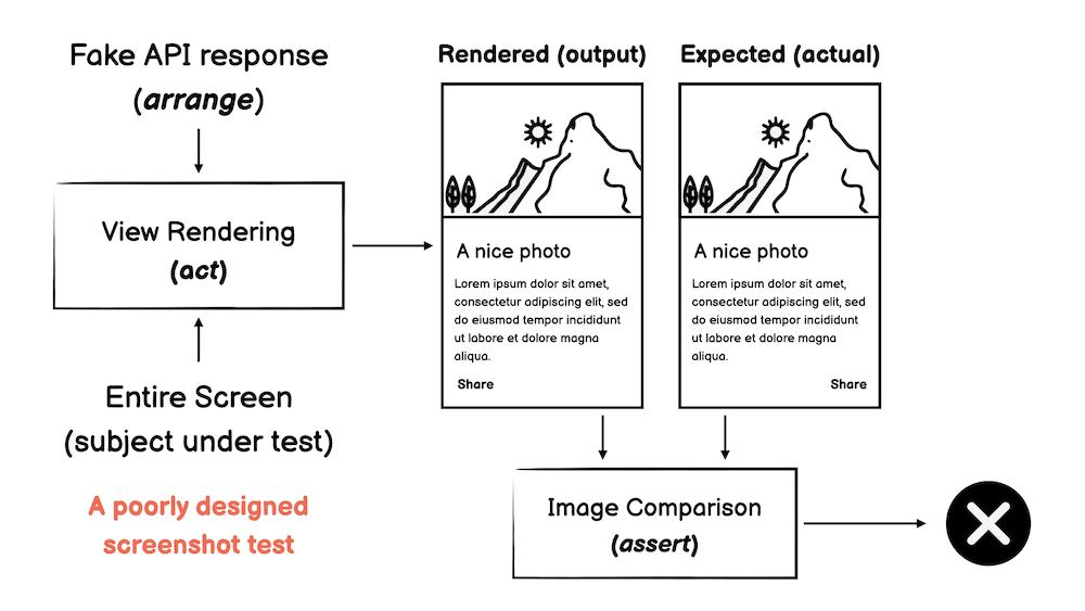
In the second one, the practice of screenshot testing arrived late in the project, at a point where the Design System implementation was already battle-tested and widespread. At that stage, most engineers failed to see how implementing screenshot test cases outside their features nails the non-functional value they want to achieve, hence implementing screenshot test cases at the feature level.
The outcome of the second situation should be easy to get: the screenshot test suite started to grow, but it was not practical to shift left visual regressions since there were overlapping between screenshots from different features, built on top of the same components but targeting only the trivial Content-Empty-Error UI states.
Final remarks#
The product scale directly reflects in the number of features we ship to users, therefore in the extension of the User Interface. Screenshot testing is a tool to detect visual regressions across the UI we build during the SDLC.
Investing in screenshot tests primarily over a Design System allows a project to catch more visual regressions as part of the test suite while reducing the number of integration tests in the long run.
As an additional benefit, we put the project in a better position to refactor the implementation of existing components, for instance, when migrating from an old to a new UI toolkit, something essential for many big projects out there which can’t elude technologies like Jetpack Compose or Swift UI.
Furthermore, Engineers must pay attention to the non-functional nature of screenshot testing and refrain from using this technique in broad integration tests. The last thing we want is a flaky non-functional test suite.
If you made it this far, thank you for your time!
Also thanks to Felipe Pedroso and Caique Oliveira for proof-reading this article.